Typographic Programming: Fonts
Apparently my last post hit HackerNews and I didn’t know it. That’s what I get for not checking my server logs.
Going through the comments I see that about 30% of people find it interesting and 70% think I’m an idiot. That’s much better than usual, so I'm going to tempt fate with another installment. The general interest in my post (and let’s face it, typography for source code is a pretty obscure topic of discussion), spurred me to write a follow up.
In today’s episode we’ll tour the fonts themselves. If we want to reinvent computing it’s not enough to grab a typewriter font and call it a day. We have to plan this carefully, and that starts with a good selection of typefaces.
Note that I am not going to use color or boxes or any other visual indicators in this post. Not that they aren’t useful, but today I want to see how far we could get with just font styling: typeface, size, weight, and style (italics, small caps, etc.).
Since I'm formatting symbolic code, data, and comments; I need a range of typefaces that work well together. I’ve chosen the Source Pro family from Adobe. It is open source and freely redistributable, with a full set of weights and italics. More importantly, it has three main faces: a monospace font: Source Code Pro, a serif font: Source Serif Pro, and a sans-serif font: Source Sans Pro. All three are specifically designed to work together and have a range of advanced glyphs and features. We won't use many of these features today but they will be nice to have in the future.
Lets start formatting some code. This will be a gradual process where we chose the basic formatting then build on top for different semantic chunks.
For code itself we will stick with the monospace font: Source Code Pro. I would argue that a fixed width font is not actually essential for code, but that’s an argument for another day when we look at indentation. For today we’ll stick with fixed width.
Code comments and documentation will use Source Serif Pro. Why? Well, comments don’t need the explicit alignment of a monospace font, so definitely not Source Code Pro. Comments are prose. The sans serif font would work okay but for some reason when I think "text" I think of serifs. It feels more like prose. More texty.
So I won’t use Source Sans Pro today but I will save it for future use. Using the Source x
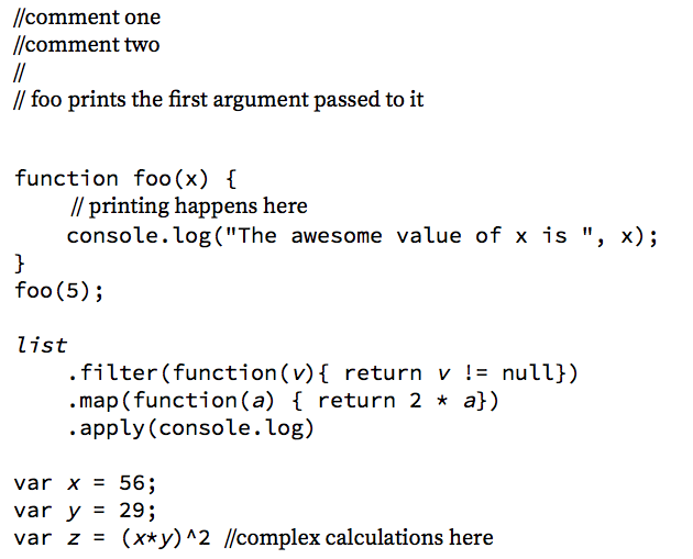
So that’s a good start but.., I can immediately think of a few improvements. Code (at least in C derived languages) has five main elements: comments, keywords, symbols, literals, and miscellaneous — or what I like to call ‘extraneous cruft’. It’s mainly parenthesis and brackets for delimiting functions and procedure bodies. It is possible to design a language which uses ordering to reduce the need for delimiters, or to be rid of them completely with formatting conventions (as I talked about last week). However, today’s job is to just restyle without changing the code so let’s leave them unmolested for now. Instead we will minimize their appearance by setting them in a thin weight. (All text is still in black, though).
Next up is symbols. Symbols the part of a program that the programmer can change. These are arguably the most important part of the program; the parts we spend the most time thinking about, so let’s make them stand out with a very heavy weight: bold 700.
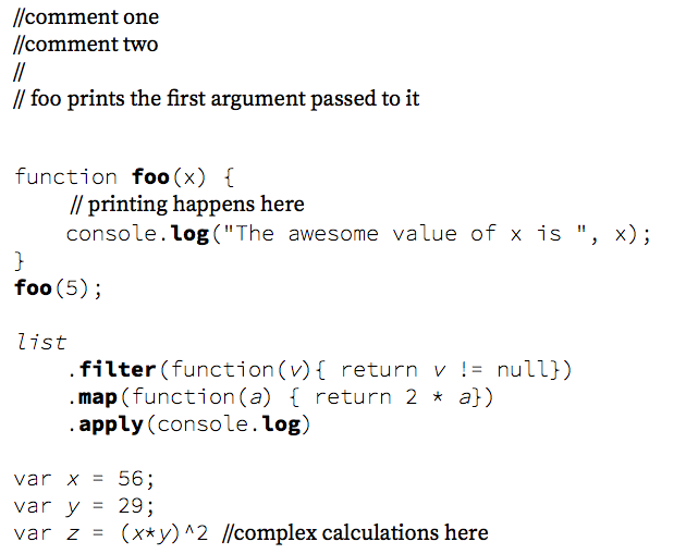
Better, but I don’t like how the string literal blends in to with the rest of the code. String literals are almost like prose so let’s show them in serif type, this time with a bolder weight and shrunk a tiny bit (90% of normal).
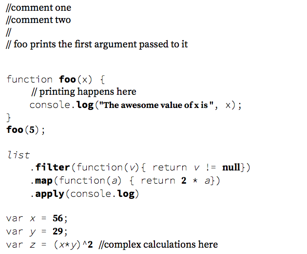
For compatibility I did the same with numeric literals. I’m not sure if ‘null’ is really a literal or a symbol, but you can assign values to it so I’ll call it a literal.
Next up is keywords. Keywords are the part of the language that the programmer cannot change. They are strictly defined by the language and completely reserved. Since they are immutable it doesn’t really matter how we render them. I could use a smiley face for the function keyword and the compiler wouldn’t care. It always evaluates to the same thing. However, unlike my 3yr old’s laptop, I don’t have a smiley face key on my computer; so let’s keep the same spelling. I do want to do something unorthodox though. Let’s put the keywords in small caps.
Small caps are glyphs the size of lower case letters, but drawn like the upper case letters. To do small caps right you can’t just put your text in upper case and shrink it down. It would look strange. Small caps are actually different glyphs designed to have a similar (but not identical) width and a shorter height. They are hard to generate programmatically. This is one place where a human has to do the hard work. Fortunately we have small caps at our disposal thanks to the great contributions by Logos and type designer Marc Weymann. Open source is a good thing.
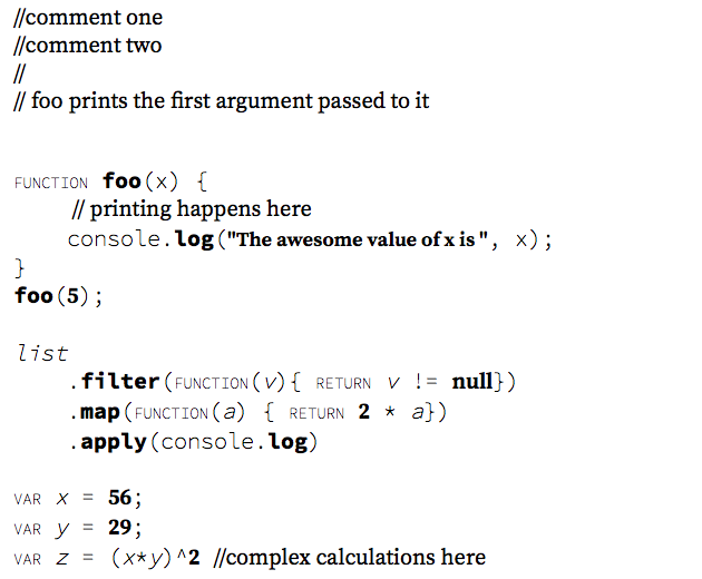
Now we are getting somewhere. Now the code has a dramatically different feel.
There’s one more thing to address: the variables. Are they symbols like function names? Yes, but it feels different than function names. They are also not usually prefixed with a parent object or namespace specifier. Really we have three cases. A fully qualified symbol like ‘baz’ in foo.bar.baz, the prefix part (foo.bar), and standalone variables that aren’t qualified at all (like ‘x’). This distinction applies whether or not the symbol is a function or an object reference (it could actually be both in JavaScript).
In the end I decided these cases are related but distinct. Standalone symbols have a weight of 400. Technically this is the default weight in CSS and shouldn’t appear to be ‘bold’, but since the base font is super light, regular will feel heavier against it. The symbol at the end of a qualifier chain will also be bold, but with a weight of 700. Finally the prefix part will be italics to further distinguish it. There really isn’t a right answer here; other combinations would work equally well, so I just played around until I found something that felt right.
This is the final version:
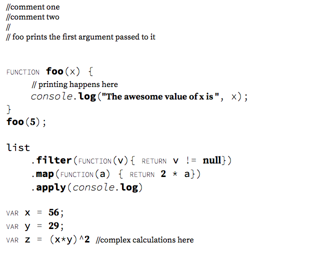
I also shrunk the comments to 80%. Again it just felt right, and serifed fonts are easier to read in longer lines, so the comments can handle the smaller size.
Here’s a link to the live mockup in HTML and CSS. This design turned out much better than I originally thought it would. We can do a lot without color and spacing changes. Now imagine what we could do will our full palette of tools. But that will have to wait for next time.
BTW, if you submit this to Hacker News or Reddit please let me know via Twitter so I can answer questions.
Posted August 25th, 2014
Tagged: programming fonts