Tabs vs Spaces, the Pointless War
So far my posts on Typographic Programming have covered font choices and formatting. Different ways of rendering the source code itself. I haven’t covered the spacing of the code yet, or more specifically: indentation. Or even more specifically: tabs vs spaces.
Put on your asbestos suits, folks. It’s gonna get hot in this kitchen.
Traditionally source code has been rendered with a monospace font. This allows for manual horizontal positioning with spaces or tab characters. Of course the tab character doesn’t have a defined width (I’ll explain in a moment why) so flame wars have erupted around spaces vs tabs, on par with the great editor wars of the last century. Ultimately these are pointless arguments. Tabs vs spaces is an artifact of trying to render code into a monospace grid of characters. It’s the 21st century! We can do better than our dad's 1970s terminal. In fact, they did better in the 19th century!
In The Beginning
Let’s start at the beginning. Fixed whitespace indenting can be used to line things up so they become pretty, and therefore easier to read. But that's a lot of work. All that pressing of space bars and adjusting when things change.
Instead of manually controlling whitespace what if we used tab stops. I don’t mean the tab character, which is mapped to either 4 or 8 spaces, but actual tab stops. Yes. They used to be a real physical thing.

In the olden days, back when we used manual typewriters (I think I was the last high school class to take typing on such machines), there was such a thing as a tabstop. These were vertical brackets along the page (well, along that metal bar at the bottom of the current line).
These tiny pieces of metal literally stopped the tabs, thus giving them the name tabstops. We were so creative with names in those days.
When you hit the tab key the cursor (a rapidly spinning metal ball imprinted with the noun: “Selectric”) would jump from the left edge of the paper to the first tabstop. Hit tab again and it will go to the next tabstop. Now of course, these tab stops were adjustable, so you could choose the indenting style you wanted for your particular document.
Let me repeat that. The tabs stops could be adjusted to the indenting style of your particular document. Inherent is the concept that there is no “one right way”, but rather the format must suit the needs of the particular document, or part of a document, that you are writing.
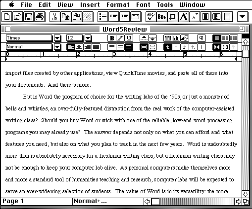
When WYSIWYG editors came along they preserved the notion of a tabstop. They even made it better by giving you nice vertical lines to see the effect of changing the tabstop. When you hit tab the text would move to the stop. If you later move the stop then the text aligned with it will magically move as well. Dynamic tabstops! Yay. We can finally rock like its the 1990s.

Semantic Indentation
So why do we go back to the 1970s with our text editors? Tabstops are a simple concept for semantically (sorta) indenting our code. Let’s see what some code would look like with simple tabular semantic indenting.
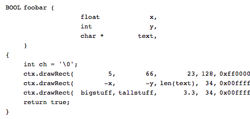
Here’s some code with no formatting other than a standard indent.

This is your typical Cish code with brackets and parameters. It would be nice to line up the parameters with their types. The drawRect code is also similar between lines. We should clean that up too.
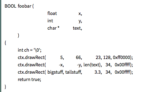
Here is code with semantic indenting.

How would you type in such code? When you hit the tab key the text advances to the next tabstop. these tabstops are dynamic, however. Instead of giving you a line with a ruler at the top, the tabstops automatically expand to fit the text in the column. Essentially they act more like spreadsheet cells than tab stops.
Furthermore, the text will be left aligned at the tabstop by default, but right aligned for text that ends with a comma or other special character. This process is completely automatic and hidden, of course. The programmer just hits the tab key and continues typing, the IDE handles all of the formatting details, _as it should be_. We humans write the important things (the code) and let the computer handle the busy work (formatting).
The tab stops (or columns if you think of it as a table) don’t extend the entire document. They only go down as far as the next logical chunk. There could be multiple ways to define a ‘chunk’ semantically, but one indicator would be a double space. If you break the code flow with a double space then it will revert to the document / project wide defaults. This lets us use standard indentation for common structures like functions and flow control bracing, while still allowing for custom indentation when needed.
Ludicrous Speed
Furthermore, using semantic indentation could completely remove the need for braces as block delimiters. Semantic indentation can replace where blocks begin and end.
if(x==y) {
     foo
} else {
     bar
}
becomes
if x==y
     foo
else
     bar
and
if(x==y) {
     foo
}
can become
if x==y
     foo
or even
if x==y foousing the tab character.
This might be a tad confusing, however, because there is only whitespace between the `x==y` and the `foo`. How do we know its not a space instead? If you hit the tab key, which indicates you are going to the next chunk instead of just a long conditional expression, the editor could draw a light glyph where the tab is. Perhaps a rightward unicode arrow.
Now I know the Rubyists and Pythoners will say that they've already removed the block delimiters. Quite true, but this goes one step further.
Python takes the choice of whitespace away from the programmer, but the programmer still has to implement it. With semantic indentation the entire job of formatting is taken away. You just type your code and the editor does the right thing. Such a system also opens the door for alternative rendering of the code in particular circumstances.
Better Fonts
And of course we come to our final advantage. Without manual formatting with spaces we don't need to be restricted to a monospace font anymore. Our code could look like this:

Semantic indenting. Less typing, more readable code. Let’s rock like it’s the 1990s!
Posted September 2nd, 2014
Tagged: fonts programming